Case Study
Pata
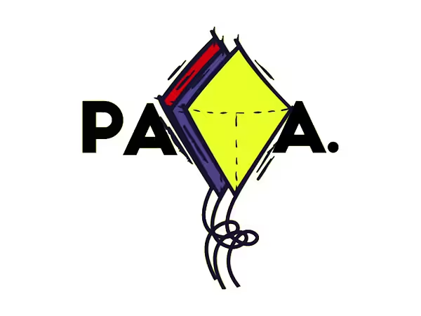
An in-house website concept for an independent music production house, combining bold visual identity with cinematic transitions, interactive spotlight effects, and a performance-led digital presence.
Problem
A music production house needs to communicate creative capability quickly while avoiding the generic structure of a corporate portfolio. The experience needed to feel expressive and memorable without sacrificing clarity.
Design Goals
- Build a distinctive visual identity around a high-energy accent color.
- Create a cinematic browsing experience with custom transitions.
- Use motion and spotlight interactions to add personality.
- Keep portfolio, capabilities and contact information easy to understand.
Process
Design process
- 01
Empathize
Understand the studio's creative identity, audience expectations and portfolio needs.
- 02
Define
Frame the challenge as balancing expressive visual storytelling with clear information architecture.
- 03
Ideate
Explore motion language, spotlight hover effects, editorial layouts and visual identity applications.
- 04
Design & Prototype
Create high-fidelity pages, transition screens and interactive portfolio behaviors.
- 05
Testing
Review visual hierarchy, navigation clarity, interaction discoverability and brand consistency.
Key UX Outputs
Stakeholder insights · Problem framing · Information architecture · User flows · Wireframes · High-fidelity UI · Interactive prototype · Usability feedback
Design Decisions
Style guide
- Brand Yellow#EBF620Primary brand signature / high-energy accent
- Black#000000Primary text / contrast / visual weight
- White#FFFFFFPrimary canvas / negative space
- Red Accent#E31B23Selective expressive accent
- Warm Gray#66615CSecondary text / supporting neutral
Approach
Design principles
Hierarchy
Use size, weight, spacing and contrast to make the next action or most important information obvious.
Consistency
Repeat components, states, spacing and interaction patterns so users can build familiarity.
Accessibility
Maintain strong text/background contrast and avoid relying on color alone to communicate status.
Feedback
Make changes, exceptions, success and confirmation visible at the moment they happen.
Content clarity
Prefer concise labels, meaningful status language and progressive disclosure over dense explanation.
See every screen, state and interaction behind the Pata interface in the full Figma file.
Explore the full design in FigmaMore Work