Case Study
Runvelle
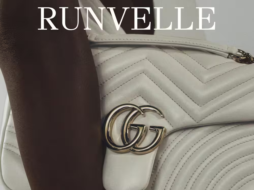
A modern online fashion platform designed around editorial presentation, seamless browsing, and an immersive product-detail interaction where scrolling changes the featured model/product.
Problem
Fashion e-commerce can become repetitive when product discovery is reduced to static grids. Runvelle needed a more editorial experience that communicates style while still supporting efficient browsing and product comparison.
Design Goals
- Create a visually immersive fashion identity.
- Make product discovery feel editorial rather than purely transactional.
- Use motion and scroll interaction to strengthen product storytelling.
- Maintain clear navigation and shopping structure beneath the visual experience.
Process
Design process
- 01
Empathize
Review fashion-commerce patterns, visual expectations and product-discovery behaviors.
- 02
Define
Identify the balance between editorial immersion and usable commerce navigation.
- 03
Ideate
Explore hero compositions, model transitions, product grids and scroll-driven storytelling.
- 04
Design & Prototype
Build high-fidelity layouts and interactive transitions for a seamless shopping journey.
- 05
Testing
Review hierarchy, discoverability, motion cues and continuity between editorial and commerce sections.
Key UX Outputs
Stakeholder insights · Problem framing · Information architecture · User flows · Wireframes · High-fidelity UI · Interactive prototype · Usability feedback
Design Decisions
Style guide
- Warm White#F7F5F2Primary surface / editorial canvas
- Charcoal#202020Primary typography / high contrast
- Stone Gray#A1A49FSecondary text / muted UI
- Warm Taupe#8C847FSupporting neutral / imagery harmony
- Terracotta#D04020Small accent / interaction emphasis
- Soft Blue#708FB0Occasional supporting accent
Approach
Design principles
Hierarchy
Use size, weight, spacing and contrast to make the next action or most important information obvious.
Consistency
Repeat components, states, spacing and interaction patterns so users can build familiarity.
Accessibility
Maintain strong text/background contrast and avoid relying on color alone to communicate status.
Feedback
Make changes, exceptions, success and confirmation visible at the moment they happen.
Content clarity
Prefer concise labels, meaningful status language and progressive disclosure over dense explanation.
See every screen, state and interaction behind the Runvelle interface in the full Figma file.
Explore the full design in FigmaMore Work